Counselor Branding
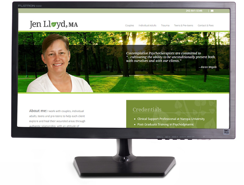
Project Description: Jen asked me to create a nature-based design for her collateral that conveyed a feeling of safety and calm. I felt that Jen’s welcoming smile naturally showed the kindness and understanding she possesses, so I suggested that we feature her portrait juxtaposed in front of a serene natural scene on her home page so visitors could feel her inviting warmth and implicit safety right from the start.
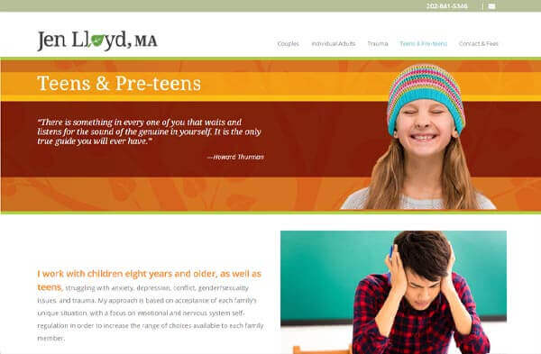
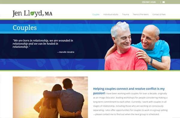
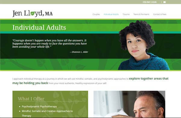
I started the project, by visiting Jen at her office where I shot photos of both her and her office (featured on her contact page). Then I created a few design concepts for Jen to choose from and designed the full site to compliment the chosen design direction. I also suggested that we create a special boxed section on each page to showcase Jen’s unique offerings at a glance. Finally, I created a polished logo that complimented the site.
Jen has gotten many compliments on her site and I couldn’t be more pleased because she’s a great person who is delightful to work with.
LOGO DESIGN


